OPPPSSSS Belated Uploading of Homework
I was just going through my blog and realised I hadn't uploaded the repeats that we had done in class, i swear i had already done it but looks like it didnt get posted so here it is...

half drop
Created this one by following the tutorial thats available on uts online.... basically you create your image extend the canvas size then duplicate it and move the second one up so it sits in the middle of the previous one on the side, and do the same for the one below.

blended half drop
Blended half drop follows the same principles however to eliminate seams and track marks using the blur, clone and other tools.

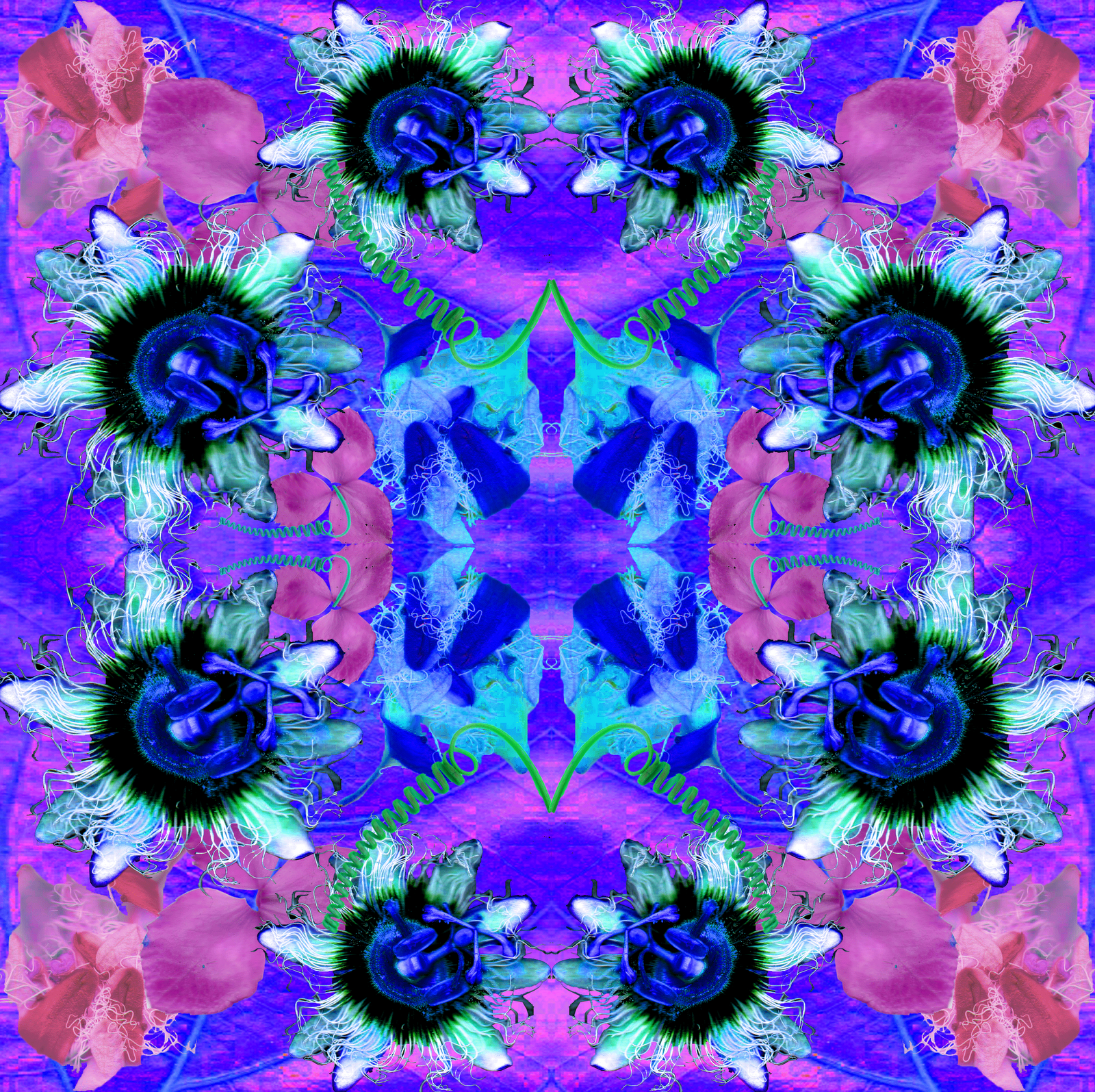
Toss repeat.
Completed this using the tutorial... in simple terms set up the page using guides to cross the page so that there is 4 sections. Place the image into the middle page of each section then use other images to cover one of the corners along the guide lines... then move the horizontal half above the guide line down to the bottom horizontal line... and do the same along the vertical guide line.... so you should now have a filled in square! thats just simple terms but the tutorial on uts online in which we used has it in more technical terms.
Here is some examples of other types of repeats.

stripe

brick

spot

Diamond

Tossed
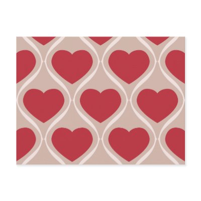
Ogee

Mirror